Originally posted by Sofia Hariz
Here’s an undeniable truth – we all judge books on their cover. And by books I mean people, movies, video games, thumbnails YouTube videos and…well, books (if any of you even read anymore). And either old age is turning me blind or every video game-, movie-, and TV-poster all look the same.
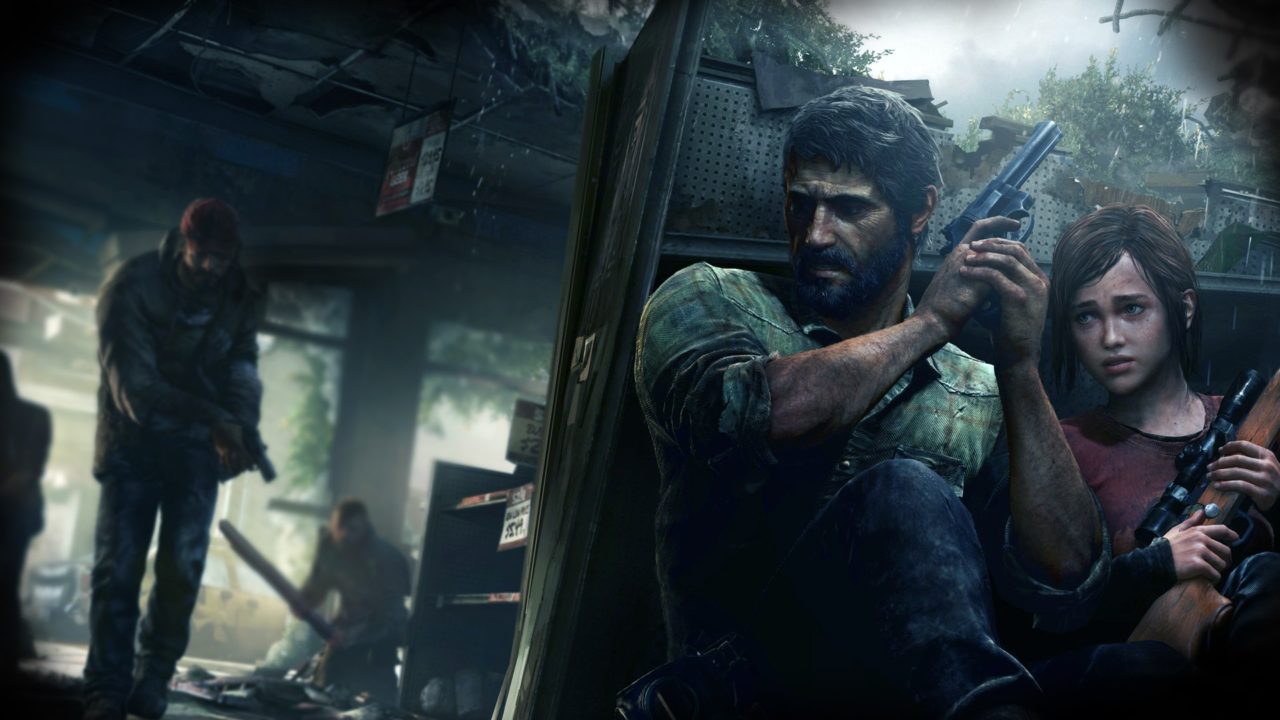
Grey is the new …every color ever, at least if you take a look at the biggest games of the year’s cover art. Just like with horror movies and equally horrid tv-shows like The Walking Dead (get it!? I WANNA LOVE IT BUT I CAN’T), it appears as if every cover designer was assigned only a few colors to work with – black, grey, white and some washed out yellow shade. Oh, and maybe some crimson red to” brighten” things up.
I imagine the conversation between the developer and cover designer going something like this:
Artist: “So I have this really cool idea for the Rise of the Tomb Raider_ cover. So she’s standing in front of this beautiful, vivid forest and…”
Artist’s Boss: “Greyscale”
Artist: “Well, the last one was very grey, so I thought we could do something a bit more vibrant and differ–”
Artist’s Boss: “Greyscale”
Artist: “…but every other game cover is–”
Artist’s Boss: “Greyscale”
Artist:…..But wha–”
Artist’s Boss: “Grey…..scale…..”
Artist: “Maybe just consider standing ou–”
Artist’s Boss: “Greyscale”
Rise of the Tomb Raider, Fallout 4, Batman: Arkham Knight, The Witcher 3: Wild Hunt, Bloodborne, Mortal Kombat X, The Order: 1886 – the list goes on. Sure, in terms of games such as Everybody’s Gone To The Rapture and Dying Light the palette works, yet it’s an interesting trend in how game covers all seem to follow the same recipe – again, very similar to movie posters.
Either they know it works, or they want to seem as drifferent from Nintendo games as possible because ADULT GAMES ARE SUPER SERIOUS AND NOT JUST A GAME BLABLABLA.
At least we had Project CARS, Hotline Miami 2 and whatever Nintendo released this year to brighten things up I suppose. Hell, even FIFA 15 looked surprisingly grim this time around. In my opinion they should put an inflatable man on the cover to make it seem at least a tiny bit different from every other FIFA game ever – they are after all on football stadiums right? Actually the should put inflatable men everywhere. I’d buy anything with an inflatable man on it. Even a Watch Dogs sequel (can you feel the burn?!?).
I guess my point is this: they are video games, and they’re supposed to be fun. Not only that – they’re supposed to capture the essence and fun behind a game, regardless of the subject matter. And there were plenty of those games on that list that could have had a more colorful, bright and vivid cover, especially Fallout and Uncharted.
Just looks at last year’s game covers. Far Cry 4 and…. actually, there weren’t that many cool games to speak of last year. But think about it – besides having that somewhat offensive first-take on their cover, Ubisoft nailed the Far Cry-cover. It’s interesting, colorful and proves that a game doesn’t have to be grey scale all the time for it to be taken seriously.
I’d think to try and have my game cover stand out, add something different to the equasion. Like my new game Call of Customs Duty: Norwegian Whorefare, set to be released never.
As someone who wasn’t too intrigued by Bioshock, the cover for Bioshock Infinite caught my eye every time I’d walk into a Gamestop, resulting in me eventually deciding to give it a shot – and by shot I mean that I ended up playing it for 14 hours straight. Same goes with GTA V, Far Cry: Dragon Blood, Journey and not to mention the Left 4 Dead-cover, which had the most beautiful shade of green.
We are judgemental creatures, and we judge things, including entertainment, based on how they look more than we think. Just as a horror fan might lean towards the movie with the scariest looking poster, it appears as if the gaming industry believes all gamers want are super-serious FPS-games with dark and serious covers. This might just be me, but I don’t feel as tempted anymore to try out games that look the same. Imagine if you haven’t seen a bunch of gameplay and trailers, and you’re simply standing in a Cex looking for an old game to try out – will you go for the standard grey FPS-cover or something different? I want a game to tell me “hey, I’m not like everybody else!”, and looking at games such as Call of Duty and Battlefield, I never get that feeling anymore, even if some of the games in those franchises did differ from the others.
And as a horror film fan I am BEGGING studios to stop using the same poster guide – seriously, I firmly believe you’re all using the same InDesign template.
My point I suppose is this one – in industries like video games and movies you should at least try to stand out. For people who are looking into trying out video games, maybe make the choice a bit easier. I mean, I can imagine it being hard enough having to spit out hundreds of pounds/dollars for a console alone, as well as investing in an expensive game and even a season pass since that’s a thing now.
Please let next year be a bit more colorful visually. Rant over.
End of rant. Until next time – smiling faces!


