This isn’t the type of thing I usually write about. Honestly, it’s not the type of thing anyone needs to write about, not frequently anyway. University Challenge is a British institution. A quiz show pitting universities, personified by a team of four of their best, brightest, and often seemingly weirdest students, against each other in a tournament where the rules regarding which winners return to face which highest ranked losers are almost as complex as the exceedingly difficult questions themselves.
It’s show that’s just there, a stalwart of TV since 1962. The format is consistent, the show runs like clockwork, and it’s a comforting watch each Monday knowing the show began decades before I was born and will likely outlast me too, with very little change. This week however, with the debut of series 53, the show did change. In big ways and small. For any other quiz show this wouldn’t be newsworthy, but for University Challenge? This notable redesign is one of the biggest moments in the show’s sixty year history.
I’m okay with not getting the answers right while watching University Challenge. It’s the hardest quiz on TV – it’s to be expected. But when I do get one right, usually some pop culture question thrown in to catch the pretentious brainboxes out, it’s better than getting a hundred correct answers when watching any other quiz show. Although, to avoid completely going mad from my own intellectual inadequacy, I often need to create little games myself. You can go for the Karl Pilkington minigame: instead of trying to guess the answer, guess which player is going to buzz in to answer. I also often find myself infuriated by the smallest details. Each year offers the question of who will I get annoyed with just by the way they sip their water after every answer, or their ludicrous haircut, or the way they dare express any emotion after getting a question right?
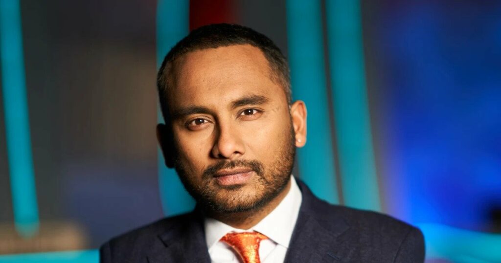
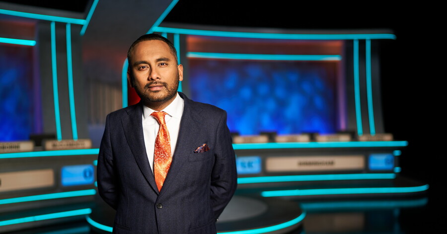
Asking those questions used to be Jeremy Paxman, or Bamber Gascoigne before him. Now however, there’s a new host, only the show’s third in its 60+ year history: Amol Rajan. It’s disconcerting seeing a new face behind that desk. At the start of the episode it felt wrong but, magically, by the end I was onboard. Rajan will likely grow into the role, find his niche, but already he’s a competent host who isn’t trying to copy those who came before. When Paxman announced he would be leaving, I was hoping for Samira Ahmed to take on the role, but now I’m eager to see how Rajan progresses. He’s affable and friendly, in awe of the talent on display, but still enforces respect. He issues the famous “come on” a few times to slow answerers but without the grumpiness of Paxman. Rajan is like the cool teacher at school who is passionate about education but with the flash of a gold watch in his sleeve and the chance he’ll talk to you about video games or movies if you finish the work early.
Rajan’s appointment to the role also changes the game from the way it has been for the past few years. Paxman’s health issues began to show in his final episodes, with him reading the questions at a slower pace. Rajan instead speeds the game up to an unprecedented level. His delivery gets faster and faster as the episode reaches its end, and the contestants respond in turn, adding to the tension. If this was a Paxman episode, I don’t think he would have got through the amount of questions that Rajan did, which ultimately led to Manchester drawing level with Trinity College Cambridge. Rajan is also asking the questions off a tablet, embedded in the desk in this weird enclosure. I wonder if they had tried to get Paxman to use a tablet and he instead told them where they could stick it. I do miss the old school question cards.
Tuning into the episode, I was expecting the only change to be the host, which is a big enough alteration by itself. But no, other things were drastically different. The production team had taken this presenter shakeup as an opportunity to revamp the set for the show. This I’m much less positive on. It’s kinda ugly, and by kinda I mean alotta. It all looks so garish. I miss the class and elegance of the old set. They likely want to move the show’s image away from one of preciousness but they’ve gone the other way. It looks cheap and ugly. Blue lights everywhere that hurt the eyes. The new desks seem like cheap plastic, and when a player started hitting it in frustration you could hear the hollow sound.
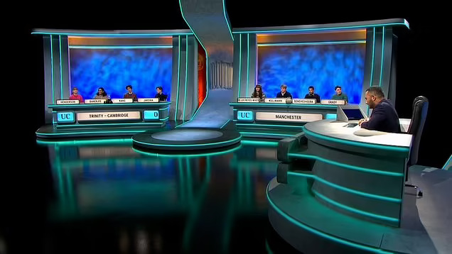
I don’t know if it is intentional but the redesign, from the material to the colours to the font, felt like a throwback to old eighties quiz shows. I felt like I was watching Challenge during the daytime. Alan Partridge’s Skirmish on digital cable channel UK Conquest. I was expecting Michael Barrymore to pop up and jam a long thin microphone in someone’s face, or for Rajan to show the losers what they could have won before panning over to see Roger Tilling doing his voice over duties from the deck of a speedboat. This is University Challenge, the most elite and pompous quiz show, and the production design shouldn’t shy away from that. I am glad the glass dividers, a relic of Covid, are finally gone. The lighting, though, is also an issue. It’s now so harsh and bright, presenting every teenage spot disturbingly clearly.
What a great match to begin a new series with. So much so that I’m guessing it must have been chosen to be the series premiere rather than happening accidentally. Rajan was probably asked to record the introduction, welcoming viewers to the new series, after the game took place and they realised what a humdinger they on their hands. It was a reminder of just how enjoyable the show can be. How thrilling a competition between nerds University Challenge is, even if you have no hope of getting the questions right yourself. Enough of that old University Challenge DNA remains in this new look version of the show, or ameliorated even, under the already comfortable tutelage of Amol Rajan. Not all the changes are positive but those that aren’t are just visual, surface-level aspects. Sometimes you can’t beat the classics.


